Misc. Design Things
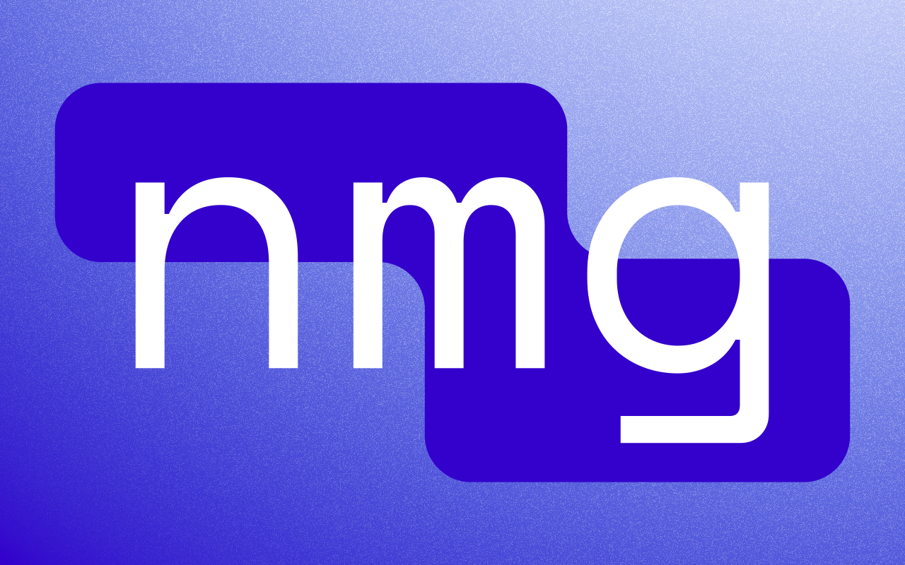
New Matrix Group
While helping build some of the underlying data pipelines for a business intelligence startup, I decided to take a bit of time to create a logo for the company, since we did not have one yet. I wanted to match the tone of our pitches to potential clients. Many of the clients were mid-size clothing retailers that had been using the same business intelligence solutions for many years, so we wanted to emphasize that with our solutions, we could provide easier access and deeper insights into a company’s accounting and sales statistics.

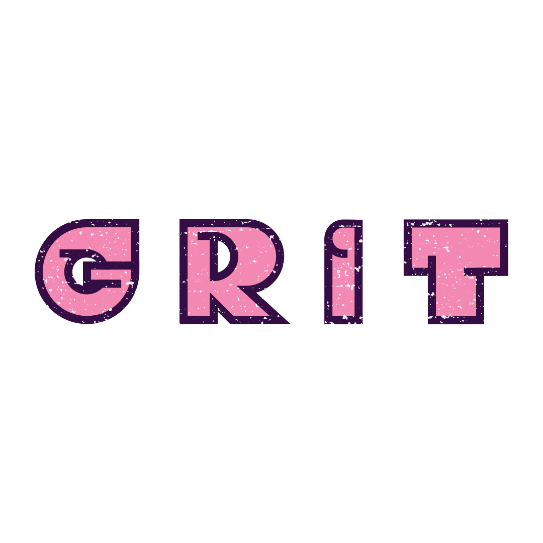
GRIT
I started to see a lot of graphic design content on social media, and felt inspired to practice some new techniques. I wanted to try my hand at creating a wordmark for a logo from scratch - that is, by constructing the letters myself rather than using a pre-existing typeface. In order to do that, I created a grid system and a set of rules that each letter would follow. One rule (or guideline, really) was that each letter should have at least one segment where its outline extended past the corner.

In keeping with the theme suggested by the word ‘grit’, and again inspired by trends on social media, I worked with some texture assets to get an effect that I thought worked well.

Afternoon Cupcakes
As an exercise, I challenged myself to make a logo for a bakery, and came up with this. I did this back in high school, but I still think it's cute. I remember being pleased with the font at the time (Abril Fatface if you're curious).
